Figma to code handoff: how to ship designs without drift
Figma to code handoff works when tokens, components and a ready-for-dev gate are shared artifacts. Here is how to set each one up.

Introduction
A good Figma to code handoff stops drift by making three things shared: the design tokens, the components and the "done" signal. Screenshots and redlines do none of that. If the file and the codebase use different names for the same thing, the build will wander away from the design within a sprint.
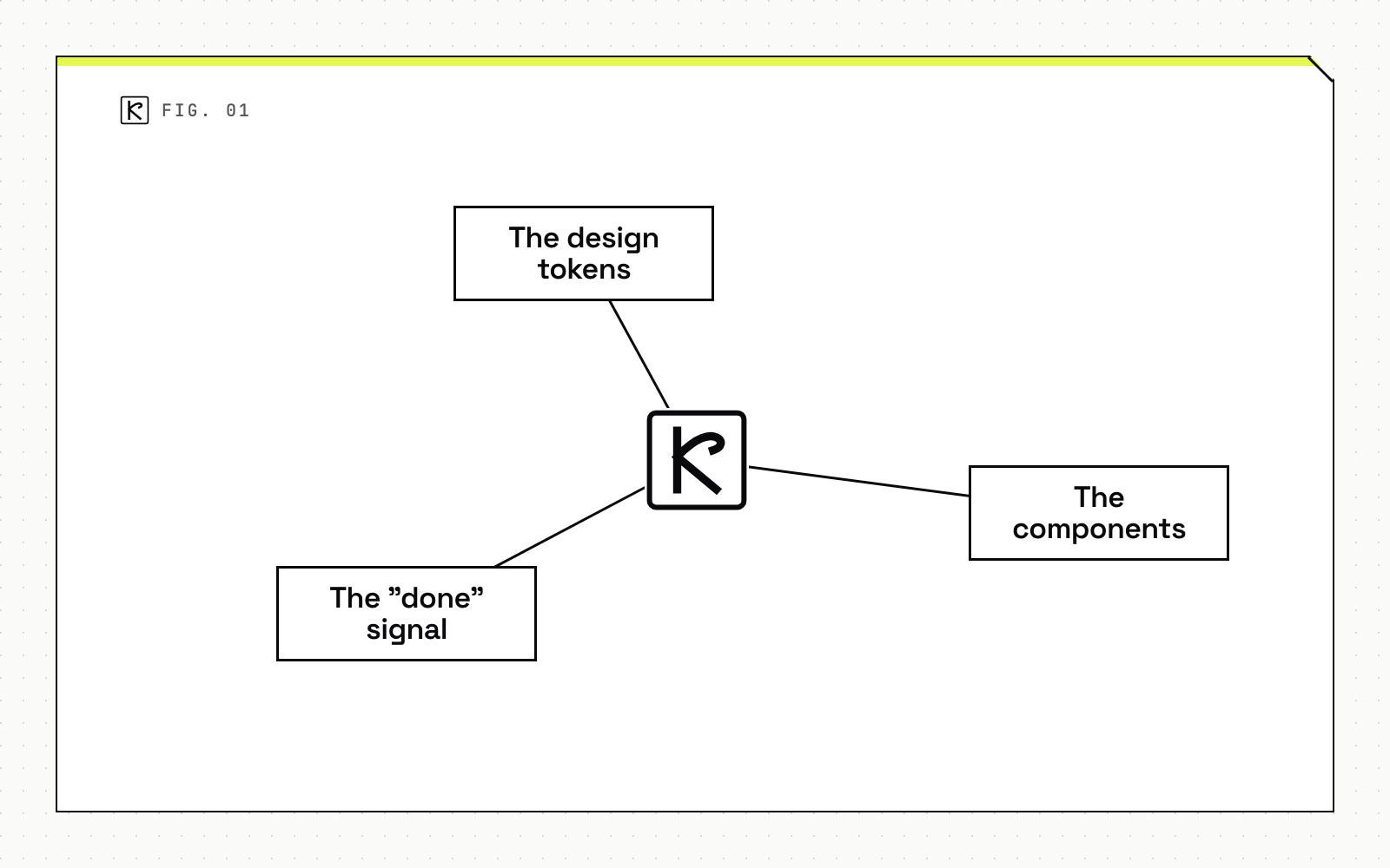
This guide is for product leads and engineering managers who keep seeing "close, but not quite" in review. It covers what drift is, how to make tokens the single source of truth, how to map components to code, and how to gate and review the handoff.
What drift is and where it comes from
Design drift is the gap between the approved Figma file and the interface that ships. It rarely comes from carelessness. Two things cause it: values that exist only as numbers, and components that exist only as pictures.
Hardcoded values and near-match colors
When a developer sees #3B82F6 in an inspect panel, the cheapest move is to paste it. Six months later the design system changes the primary color and the pasted copies stay behind. Figma's own design systems team found this the hard way. When it moved its colors into variables, it discovered over 280 outdated color instances, many using the wrong color ramps. Those colors had been tracked in spreadsheets that people maintained by hand.
Components rebuilt instead of reused
The second source is a button, card or modal rebuilt from scratch because nobody knew a version already existed in code. The result looks right in the first screenshot and diverges the moment a state or a breakpoint is added. Both problems have one cure. Give the developer a name to reach for, not a value to copy.
Make tokens the single source of truth
Design tokens are named design decisions: colors, spacing, type sizes. In Figma they live as variables. In code they live as CSS custom properties, Swift constants or a theme object. Drift shrinks when both sides use the same names and the same values come from one place.
Name variables like the code
Match the naming. If the CSS custom property is named color-primary-500, the Figma variable should be color/primary/500. Any mismatch creates a translation step, and translation steps are where errors enter. Figma's code syntax field on a variable lets the designer keep a friendly name while Dev Mode shows the developer the real property, such as the color-icon-onbrand custom property.
Sync automatically
Manual export causes drift too. Figma's team runs a GitHub Action that triggers when its color library publishes and syncs the tokens into the CSS file. The same page notes that Dev Mode will match a raw 4px value to the corresponding variable and show the spacer-2 custom property, which catches cases where a designer skipped the variable. It also converts units, so a pixel value from the design can appear as rem and respect the user's font-size setting.
Use the standard format
Token files used to be tied to one tool. On October 28, 2025, the W3C Design Tokens Community Group announced the first stable version of the Design Tokens Specification, 2025.10. It adds theming for light and dark modes, Display P3 and Oklch color, and aliases between tokens. Figma, Sketch, Penpot, Framer and others support or are implementing it, and Style Dictionary and Tokens Studio provide reference implementations. If you are choosing a token pipeline today, pick one that reads and writes this format so you are not locked to a single design tool.
Map components to code
Tokens cover values. Components cover structure. Every component in the Figma library should point to its code twin.
- Link the source. Dev Mode lets you attach resources to a component. Figma's team links each component to its Storybook entry and its GitHub source, so a developer can go straight to the file to edit when a variant changes.
- Name layers for people. Replace "Frame 123" with "feature callout" or "main content". Meaningful names, and fewer stray layers, cut the guesswork during implementation, as the Figma handoff handbook from April 1, 2025 points out.
- Keep variant names equal to prop names. If the code takes
size="sm", the Figma property should readsize / sm.
When a design deliberately departs from a library component or a variable, say so in a comment or an annotation. An unexplained deviation looks like a mistake, and the developer will either "fix" it or copy it into three other places.
Gate the handoff with Ready for dev and annotations
Handoff should start at a defined moment. Figma's "Ready for dev" status is that moment: it signals that a frame, section or component is finalized and approved for implementation. Developers can then see which parts of a file are settled and which are still moving, and designers stop receiving questions about frames they have not finished.
Annotations carry what the picture cannot. Per the same handbook, they should cover spacing and measurements and clarify whether a property is fixed or responsive. A short checklist before flipping the status:
- Every color, spacing and type value uses a variable or a style.
- Every reusable element is a library component, not a detached copy.
- Layers are named and unused layers are deleted.
- Annotations explain behavior that a static frame cannot show.
- Assets have export settings (format and size) set in advance.
Mark what is fixed, what is responsive and what comes from content
Three kinds of information get lost most often.
Fixed versus responsive. A card that is 320 px wide in the frame might be a fixed width or a fluid one with a maximum. Annotate it. Otherwise the developer picks, and the design reviewer disagrees.
Content from a CMS. Annotations should also mark which images and text come from content and which are baked into the design. A hero image that editors will replace needs an aspect ratio and a crop rule, not a single exported file. If your team is still deciding where that content lives, see choosing a CMS for a Next.js marketing site.
Semantics. A heading styled like a subtitle is an accessibility problem if the code does not reflect the intended hierarchy. The handbook advises documenting how text styles map to heading levels, such as H1 versus H3, so implementation does not follow visual appearance alone.
Catch drift in review, not in production
Even a clean handoff needs a feedback loop. Three habits help.
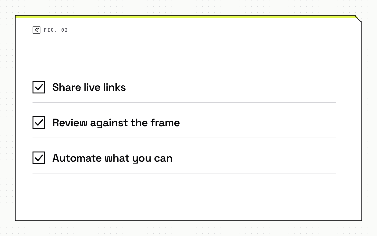
- Share live links. Send the Dev Mode link rather than a static export, so developers always see the current state. Mention developers by name in comments so questions get answered where the context lives.
- Review against the frame. Put the Figma frame next to the preview deployment in the pull request. Check tokens first, then spacing, then states. Most drift shows up in those first two.
- Automate what you can. A linter that rejects raw hex values and pixel spacing in styles catches the pasted-value problem before a human has to. Where visual weight is the concern, you can enforce budgets in CI the same way, so a design that looks right but loads slowly still fails the build.
Treat handoff as an ongoing process. The handbook's framing is that it is not a single moment, and designers should stay available for questions after the file is marked ready.
Conclusion
Drift is mostly a naming problem, not a skill problem. Give tokens the same names in Figma and in code, sync them automatically, link every component to its implementation, and use a clear "ready" signal with annotations for anything a static frame cannot show. Then review the build against the frame, not against memory. Teams that offer product design and development in one workflow have an easier time here because both sides already share the same files, but the practices above work for any split team.
Frequently asked questions
What is design drift?
Design drift is the gap between the approved Figma file and the shipped interface. It shows up as hardcoded values, near-match colors and components rebuilt instead of reused.
Do we need Dev Mode to avoid drift?
No, but it removes guesswork. Code syntax on variables shows the exact CSS custom property, and linked Storybook and source entries point developers to the existing component.
What should a Figma token be named?
Name it to match the code. If the CSS custom property is named color-primary-500, the Figma variable should be color/primary/500, so nobody maps names by hand.
When is a design ready to hand off?
When it is marked Ready for dev, uses variables and library components, has named layers, and carries annotations that say which properties are fixed or responsive.