Dispensary website design: 12 elements that turn browsers into orders
A dispensary site converts when the age gate, menu, speed and checkout work together. Here are 12 design elements, each tied to a primary source.

Introduction
Good dispensary website design shortens the path from landing page to cart, keeps the menu fast, and removes anything that blocks a visitor or a search crawler. This article groups 12 elements into five areas. We don't quote conversion rates here. Each element is tied to a primary source or to plain engineering practice you can test yourself.
Entry and trust
1. A compliant age gate that sits on top of content
If your state requires an age check, show it. Google treats this case differently from ordinary pop-ups: "Certain sites are required to show an interstitial due to the kind of content they are publishing. For example, a casino site may need to show an age gate." Mandatory interstitials are exempt from Google's intrusive interstitial guidance.
Google still recommends two things: let Googlebot crawl your content without triggering the gate, and overlay the gate on real content instead of redirecting visitors to a separate page. A gate that replaces every URL with one verification page leaves search engines nothing to index. Test it by loading a menu URL in a private window and checking that the page behind the overlay is the real menu, not a blank template.
2. Small banners for everything else
Promotions, newsletter prompts and loyalty offers aren't mandatory, so they don't get the exemption. Google's advice is to "use banners that take up only a small fraction of the screen." Keep full-page overlays for the legal check and nothing more. A small bar at the top or bottom of the screen with a dismiss button does the job, and it never hides the menu a visitor came for.
3. Store essentials above the fold
Show the address, today's hours, pickup or delivery status and a phone number before the first scroll. A visitor who cannot tell whether you are open will leave to find someone who says so. Pull the hours from one source of truth, so the site, your Google Business Profile and your order system never disagree, and show holiday changes as soon as they are set. Rules on what a dispensary site must display vary by state, so check the cannabis website compliance checklist and your regulator before you finalize the layout.
Speed
4. A hero image that loads first
On most dispensary home pages the largest element is the hero image. web.dev says sites "should strive to have an LCP of 2.5 seconds or less for at least 75% of page visits", and treats anything above 4.0 seconds as poor.
Three fixes cover most cases.
- Set
fetchpriority="high"on the hero image. - Preload it when it is only referenced from CSS or JavaScript.
- Never apply
loading="lazy"to it. That adds delay to the one image that matters most.
5. Low time to first byte and cached pages
web.dev notes that "nothing can happen on the frontend until the backend delivers that first byte." Render pages on the server, serve them from a CDN, and avoid redirect chains and unique URL parameters that defeat caching. Measure with field data from the Chrome User Experience Report rather than a single lab run, and set performance budgets so regressions get caught before release.
Menu and filters
6. Filters that respond instantly
Menus are interaction-heavy. Visitors filter, sort, expand and add, over and over. web.dev defines INP as the latency of all clicks, taps and keyboard interactions during a visit. An INP at or below 200 ms is good, and above 500 ms is poor, measured at the 75th percentile. Slow filters usually come from large client-side menu bundles. Fewer scripts and server-filtered results help more than any micro-optimization. Test on a mid-range phone, not your development laptop, because the 75th percentile includes slower devices.
How the menu is delivered matters too. Our comparison of an embedded versus native menu covers the speed and SEO tradeoffs.
7. Product cards with price, size and availability
Show the name, brand, category, size, price and stock status on the card. Keep it factual. Don't add health or effect claims, which most regulators restrict and which this article does not cover. Use one consistent card layout, a fixed image ratio so the page does not shift while images load, and a clear label when an item is sold out instead of hiding it silently.
8. Search and category shortcuts
Put a search box and the top four or five categories near the top of the menu. Store filter state in the URL so a visitor can share or return to a filtered view, and so the back button works.
Ordering and checkout
9. A cart and order button within thumb reach
On a phone, a sticky cart bar at the bottom keeps the main action reachable without scrolling back up. Use one primary action per screen and make the cart total visible as items are added. Make tap targets large enough for a thumb, and confirm each add with a visible change, such as the cart count updating, so visitors do not tap twice.
10. A short, labeled checkout
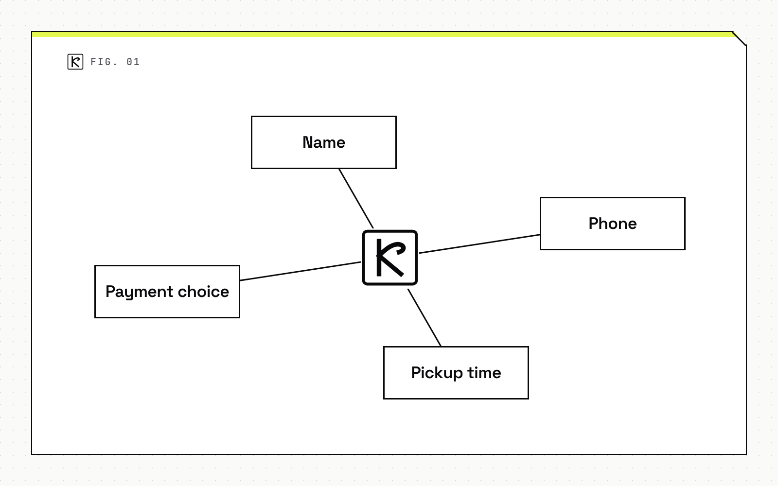
Ask only for what the order needs: name, phone, pickup time and payment choice. State the payment options and the pickup or delivery window before the final button, not after. The pickup, delivery and payment options available to you depend on your state and processor, so confirm them first. Let visitors check out without creating an account if your system and local rules allow it, since a forced sign-up adds a step between the cart and the order.
Accessibility
11. Contrast and non-color cues
The Department of Justice states that ADA Title III applies to goods and services offered on the web by businesses open to the public. Its web accessibility guidance names common barriers, including text with poor contrast ("light gray text on a light-colored background"), information shown by color alone, and images without text alternatives. Check every price, sale tag and stock label against a contrast checker, and add text where color carries meaning. Write alt text that says what the image shows, such as the product and its package, rather than stuffing in keywords.
12. Labeled forms and keyboard access
Every form field needs a label a screen reader can read, clear instructions and visible error messages. Everything must work with a keyboard alone, including the age gate, the menu filters and checkout, with a visible focus outline. The DOJ also cautions that automated checkers and overlays must be used carefully, and that a "clean" report does not necessarily mean everything is accessible. Tab through your own site once by hand. Whether the ADA applies to your situation is a question for counsel.
Frequently asked questions
Does an age gate hurt a dispensary's SEO?
A legally required age gate is exempt from Google's intrusive interstitial guidance, but it can still hurt indexing if it replaces your content. Google recommends letting Googlebot crawl content without triggering the gate, and overlaying the gate on real content instead of redirecting to a separate page.
What page speed should a dispensary site target?
Aim for an LCP of 2.5 seconds or less and an INP of 200 ms or less, both at the 75th percentile of real visits. These are the "good" thresholds published by web.dev. Check field data in PageSpeed Insights, not only lab scores.
Is a dispensary website covered by the ADA?
The DOJ states that ADA Title III applies to goods and services public accommodations offer on the web. Whether a specific site is covered is a legal question, so ask counsel. Following WCAG, which the DOJ points to as a technical reference, is the practical way to reduce risk.
Should the menu be the homepage?
Not necessarily, but the menu should be one tap from the homepage and reachable from every page. A fast load and working filters matter more than where the menu lives.
Conclusion
Start by measuring. Pull LCP and INP from field data as of October 2026, run one keyboard-only pass through the age gate, menu and checkout, and fix what fails first. If you want help building or rebuilding a dispensary site along these lines, see our web development work.